“Build it and they will come” has no place in the website world, but more importantly, the problem many marketers and companies fail to address is what to do once they do come. This is especially true for E-commerce sites. Despite a fairly clear goal of wanting users to make a purchase, many sites fail to take into consideration the actions required to move site visitors from a lead to a sale.
While a number of factors play into every purchasing decision, the following is a list of the most common mistakes to miss the cart on online sales.

- It is difficult to make a purchase - here’s a quick check: when looking at a picture of a product on your site, do I immediately know how to purchase it? Is it a one-click step? Does it take less than 5 seconds from any page on your website to reach the checkout cart? Is the shopping cart easy and non-time consuming for the client? If you answered ‘no’ to any of these questions, it is too difficult for the customer to buy. The quicker and easier it is for a customer to make a purchase, the more likely they are to follow through with completing the sale.
- Your sites structure is too complicated- have you ever been to a site with too many options or titles that are vague and didn’t lead you to the correct section? There is nothing more frustrating than knowing you want to buy something and not being able to find it, and with attention spans growing shorter by the day, consumers are no longer willing to search through mega-navigations and categories to find what they are looking for. Having a strategic site structure not only makes a website more user friendly for customers but also improves SEO and sales conversions.
- Your site makes a bad first impression- we all know how important first impressions are and an Ecommerce website is no different. That first view of a site can make or break a customer relationship.
Below are the top two mistakes that kill a first impression:
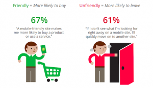
The site is not responsive- this means the website is not mobile friendly or rather, it doesn’t adjust to fit the size of the screen the site is being viewed on. Why does this matter? According to eMarketer, in 2015 mobile search will surpass desktops in both paid and organic searches.

Even if you don’t think your consumers are making their final purchases from a phone, they are likely starting their search on a mobile device. That first impression often determines if the user returns to the site on their next desktop visit. Not to mention this past April Google’s “Mobilegeddon” update released a sense of urgency for website owners to either turn mobile or be penalized in search rankings.
Poor quality images. Not every business owner can afford high end photo shoots for their website, but of all the things that our lead designer recommends spending money on, quality photography is at the top of the list.
Images tell a story; high quality ones speak not just to your products but to the value you put in your company. Low quality photos tell a customer you might as well be selling things out of a van with your smart phone camera. So how do you make it affordable? Spend on the branding photos: the team shots, bio pics and more general photos you can repurpose. For those ever changing product photos, check out this article on making the best of your smart phone.
- Last but not least- You haven’t established an online presence. This boils down to one real thing: Trust. As social networks like Facebook, and review sites like Yelp and Google + become more prevalent, consumers are becoming more reliant upon them in how they shop online. You don’t need to be everywhere, but if you’re nowhere consumers have no way of researching and learning about your brand. Social Media and Review sites allow users to see your online presence and endorsements to build trust in a brand without ever having to leave the internet. For E-commerce businesses without brick and mortar stores, this makes all the difference. Need more convincing? Take a look at this infographic by HubSpot that breaks down the facts:

Once you have these 5 mistakes in check you can start focusing on specific target audience strategies. Running a successful online store is no different from a real one; it require constant cleaning and analyzing how users shop to make sure you are providing the best buying experience possible. These mistakes are like the foundation, there’s no point in deciding what products go where if you forgot to nail in the shelves!


