In April 2015, Google changed their search algorithm to reward websites that are mobile-friendly with higher rankings. Part of the reason for this change was to accommodate for the fact that 45% of organic search engine visits in the US are on mobile devices according to Statista. The same report also notes that mobile B2C sales in the US account for almost $59 billion in sales, with that amount projected to reach $200 billion by 2018.
It’s no secret that we’re addicted to our phones, and as a business, if your website isn’t mobile-friendly, you’re missing out on traffic, sales, and attracting new customers. Luckily, Google also rolled out an easy-to-use mobile-friendly website test that just requires the user to type in a website (be sure to include the http://www. portion).
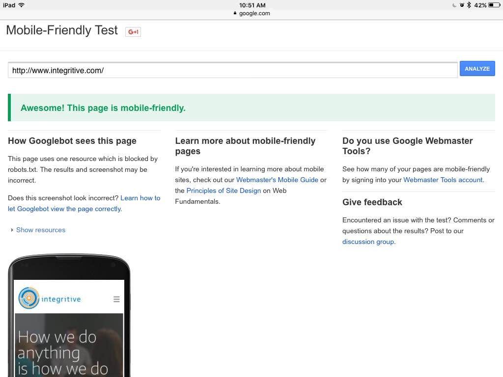
Within seconds, you’ll see, “Awesome! This page is mobile-friendly” like the results we received testing our website:

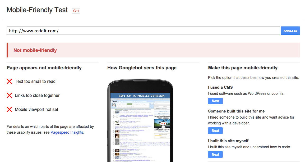
Or you’ll receive the message, “Not mobile-friendly” with a list of reasons why, like the results for Reddit.com:

Google even provides a list of reasons why the tested website failed. In the case of Reddit’s website design, the text is too small to read, links are too close together, and a mobile viewpoint is not set.
Google didn’t implement this algorithm change to punish businesses; instead, they are all about improving the user experience and acknowledge that people want to be able to easily navigate any website whether they’re on a desktop or on a mobile device. Search Engine Watch shares insights about exactly what users want out of a website mobile experience, and some of the top responses were:
- Prominent contact information, address, and business hours
- Click-to-call phone number
- Pricing
- A menu of products or services
- Photographs
- Basically having the same information available on mobile that exists on the desktop version
If your website fails the Google Mobile-Friendly test, contact us today and our Asheville website development team can get your site back on track!


